IMPROVED USABILITY OF A
DATA VISUALIZATION
DASHBOARD APP
Transformed the end-to-end experience of a strategic and
operational dashboard app for the internal employees of AbbVie
by prioritizing user needs.
I was part of an ambitious project to increase product adoption and retention of this one-stop reporting application by tailoring the experience for 150+ employees (4 user groups of 3 different departments).
To comply with my confidentiality agreement I have omitted and appropriated confidential information. These designs are a reinterpretation of the original.

ROLE
UX Designer
(AbbVie Inc.)
TEAM
David Marcus (Design Lead)
Ali Dawson (UX Researcher)
Vijay Sunny (UI Designer)
STAKEHOLDERS
Customers (45+),
Product Owner,
Business Leaders
Data Analysts (4)
Developers (7)
TOOLS
Adobe XD, Figma
Figjam, Miro
Confluence, Jira
DURATION
24 Months
CHALLENGE
AbbVie is a leading global healthcare company that develops and markets innovative medicines in more than 70 countries around the world with a focus on conditions affecting the endocrine system.
The Dashboard App − In 2020, a one-stop reporting tool was launched to empower over 150 employees (directors, managers, supervisors, and agents) with strategic and operational insights
into patients, shipments, and productivity by consolidating data from 5 BI tools.
Despite its potential, the app struggled to achieve widespread adoption, with a retention rate below 27% after a year. This was primarily due to:
-
Limited real-time data availability,
-
Lack of customization and personalization,
-
Inconsistent design.
1+ year
Since the app was launched
75 +
Total users (internal employees)
< 27%
Returning users (2020 - 21)
Design Challenge: How can we build trust and confidence in the data accuracy of the patient and productivity metrics, while simultaneously providing a seamless user experience that empowers users to effectively view and track these metrics?
APPROACH
From user research to launch, below image details the design process employed by me as part of the UX team to aid in uncovering user pain points, inform design decisions, that ultimately led to higher user adoption and retention rates within 12 months.
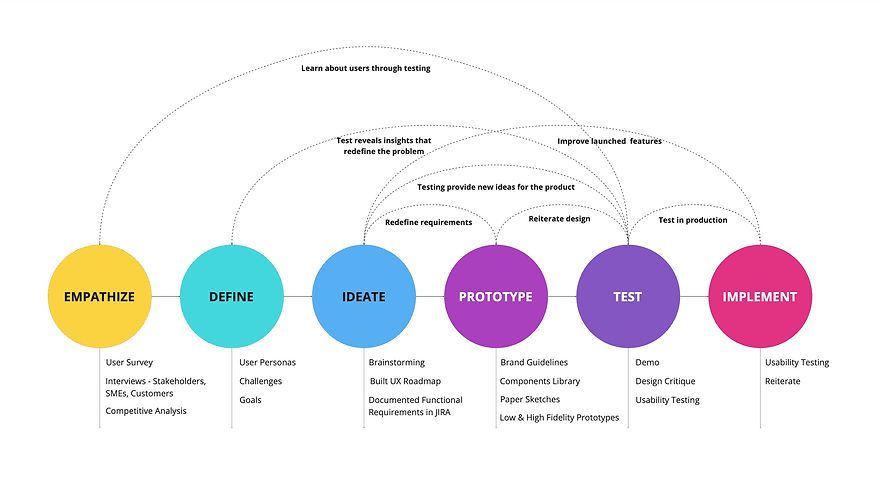.jpg)
Non-linear Design Process
DISCOVERY
Research Objective: The low user retention rate suggested a disconnect between the dashboard and employee needs. By conducting thorough user research and analyzing competitor offerings, we were
able to bridge this gap and create a more robust and user-friendly dashboard.
User Survey
In collaboration with a researcher, I developed a survey for targeted dashboard users. This survey combined quantitative and qualitative questions to gain insights on usage frequency, user preferences, and valuable feedback. Here are the key results:
.jpg)
Survey Results
User Interviews
Survey results revealed directors as the most frequent users, followed by managers, with supervisors rarely accessing the dashboard. However, even director and manager usage fell short of expectations, suggesting unmet needs. We prioritized these two user groups by interviewing 10 employees (5 directors and 5 managers) to delve deeper into their pain points and refine their specific requirements. We addressed the remaining user groups in a later phase. Here are the key takeaways from these interview sessions:
Key moments of happiness experienced by customers while interacting with the dashboard
I can access all my reporting data needs in one place which is convenient
I like the visualization of data in reports, I tend to use them in my presentations
The calendar feature is useful as I can custom select the dates I prefer
I like viewing the overall stats in the top section of the reports.
Key pain-points experienced by customers while interacting with the dashboard
I cannot drill down to a granular level the way I do with other applications.
Data needs to be verified as sometimes the data is either unavailable or incorrect.
It would be nice to be able to download the reports so that I can slice and dice the data.
I've a lack of understanding of the tool or how it can help me with my reporting needs.
Focus areas to increase usability of dashboard: User interview analysis using an affinity diagram revealed four key themes:
-
Need for Customization & Personalization: Users expressed a strong desire to tailor the dashboard to their specific needs and preferences.
-
Lack of Data Trust: Concerns about data accuracy and validity emerged as a significant barrier to user confidence.
-
Lack of Feature Adoption: A need for improved training and education on the app's functionalities was identified.
-
Need for Deeper Insights: Users requested access to more granular data for deeper analysis.
ANALYSIS
Analysis Objective: By synthesizing data from surveys and user interviews, we aimed to gain a comprehensive understanding of our target audience and their pain points. This comprehensive user profile will guide the definition of clear design goals and aid in creating effective design solutions.
User Persona
In order to illustrate the key audience of the dashboard, and to help potential stakeholders gain more sympathy for the target issues, I decided to build personas. After combining the major findings from the interviews and the surveys, I listed the insights I had developed which could impact the future design.


Brainstorming
I led 7 brainstorming sessions with key stakeholders (product owner, data analyst leads, lead developer, and the UX team) to translate user needs into actionable solutions. We focused on the four themes identified during user interviews, to find innovative and feasible solutions. The session began with generating a wide range of ideas, which were then refined into 20+ user stories documented in UX roadmap for upcoming product releases.
Learnings:
-
Clarity is Key: Clearly outlining the brainstorming process from the beginning, starting with broad ideas aided in building team confidence.
-
ICE Prioritization: Utilizing the ICE (Impact, Confidence, Ease) methodology for prioritizing ideas proved to be more efficient than traditional voting system in creating the product roadmap.
DELIVERY
* To comply with my confidentiality agreement I have omitted and appropriated confidential information. These designs are a reinterpretation of the original.
I led significant usability improvements in the existing dashboard app through design and functionality enhancements. This involved designing and refining over 25 reports, creating functionalities with clear interaction states (like file upload, forms, and export features) from scratch, and optimizing existing features. Notably, I redesigned key sections, leading to significant improvements in user experience.
Here are a few specific examples that showcase the impact of my work:
1
Refactored Navigation
Reorganized structure and improved clarity for intuitive exploration.
Design Goals: To address critical usability issues hindering user experience across over 30 modules in the dashboard, I redesigned the header section. This revamp tackled the following:
-
Information Overload: Streamlined the hierarchy and organization of content within the header, improving its clarity and scannability.
-
Fragmented Data: Consolidated related information, presenting it cohesively for a more comprehensive understanding.
-
Missing Functionality: Introduced a search bar, enhancing information accessibility and user efficiency.
-
Space Management: Optimized the upper fold by leveraging the valuable real estate effectively.
Module Icon, name
and description
Icons for Profile, All modules and Favorites

Breadcrumbs
section nav
Filters
sub-module nav
Before: Existing header section
Iteration 1
Considerations: To address potential usability challenges in the header section, particularly when interacting with its six elements, I considered the following design questions:
-
Scalability for Dropdowns: How will the design adapt to accommodate an increasing number of dropdown filters beyond 4-5 options?
-
Navigation Clarity: How should the design effectively handle the presence of both sub-module and section navigation within the header?
-
Icon Placement: What is the most effective layout for the icons, keeping them together or strategically splitting them based on function?
-
Search Bar UI: Should the search bar be initially collapsed or expanded for optimal user experience?
Reorganized information based on feature importance (repeated clicks)


5 UI variations
Iteration 1: 5 UI Variations
Learnings: Redesigning the header section initially focused on reorganization, but it didn't fully resolve the concerns of fragmented data and space management. This led to a reimagining of the section.
Iteration 2
Inspiration: I drew inspiration from navigation and data-rich header sections implemented by industry leaders like Amazon, Booking.com, and Delta Airlines to tackle the issue.

Redesign version 2


UI variations for
search, navigation
and icon sections
UI variations
Learnings: Filter section can be further optimized. Further research revealed that the search icon, due to its lower priority and click rates, could be effectively displayed as collapsed.
Iteration 3 (launched version)

BEFORE

AFTER
Module Icon, name
and description
Icons for search, profile, all modules

Filters
Primary & Secondary screen navigations
Icons for favorites
Breadcrumbs
Improved header section
Final Outcome: The launched redesign prioritizes a streamlined and minimalist UI, effectively addressing usability concerns and enhancing the overall user experience. This was achieved by combining related data (module and sub-module navs), integrating filter in the nav bar and positioning the icons by priority.
2
Developed a Components Library
Enhanced accessibility, intuitivity, and design efficiency.
Objective: Establish a unified design system in Figma. This system would addresses design inconsistencies across iterations and screens, encompassing components and variants of essential elements such as tables, charts, forms, grids, and colors, etc.
.png)
Condensed Components Library
Result and Impact: Leveraging Atomic Design methodology, I built and maintained a comprehensive component library in Figma, ensuring design consistency throughout the product's evolution. This ensured design consistency and streamlined handoff to developers, as both teams utilized the same reusable components. The library's focus on comprehensive color palettes, including qualitative, sequential, and diverging options for graphs and brands, significantly enhanced design intuitiveness
and ensured consistent visual language across the dashboard.
PERSONAL LEARNINGS
My 24 months with the product team were invaluable, fostering key learnings that continue to shape my approach. One of the most impactful lessons was the importance of implementing a robust UX process. By prioritizing a deep understanding of customer needs and requirements, we were able to effectively bridge the gap between the desired and what we provided. Additionally, I honed my ability to consider scalability during design, ensuring flexibility to accommodate future changes and growth.